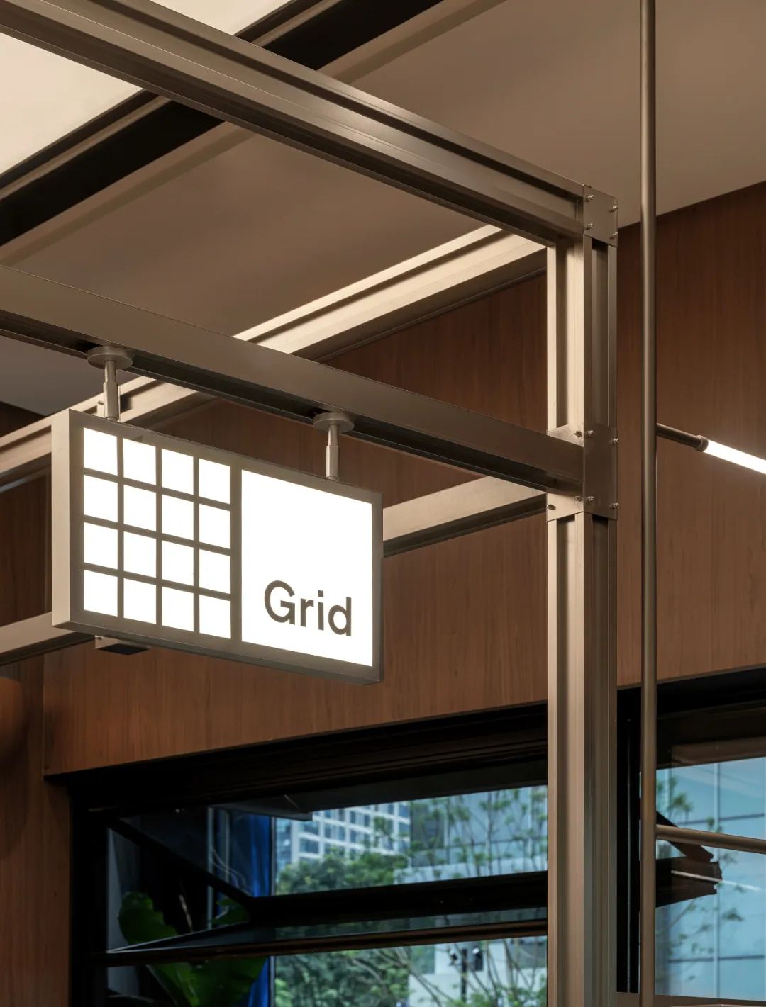
Grid是格子的意思。灵感来自平面设计里的网格系统「Grid System」。
它常见于包豪斯,或者瑞士平面风格的海报,也是常用的互联网交互设计技巧。从二十世纪初开始,这些纵横交错用于对齐的细线和格子,让平面设计从一个单凭灵感和手感的领域,开始建立逻辑和规则,逐渐形成一套可以被称为专业的东西。
这也是我们想在咖啡上做的.
--From Grid Coffee
Grid means lattice. Inspired by the grid system "Grid System" in graphicdesign.It is commonly seen in Bauhaus, or Swiss graphic style posters, and is alsocommonly used for Internet interactions design skills. Beginning in thetwentieth century, these crisscross lines and grids for alignment, Let thegraphic design start from a field of inspiration and touch, and start toestablish logic and rules, gradually formed a set of things that can becalled professional.This is what we want to achieve with coffee.
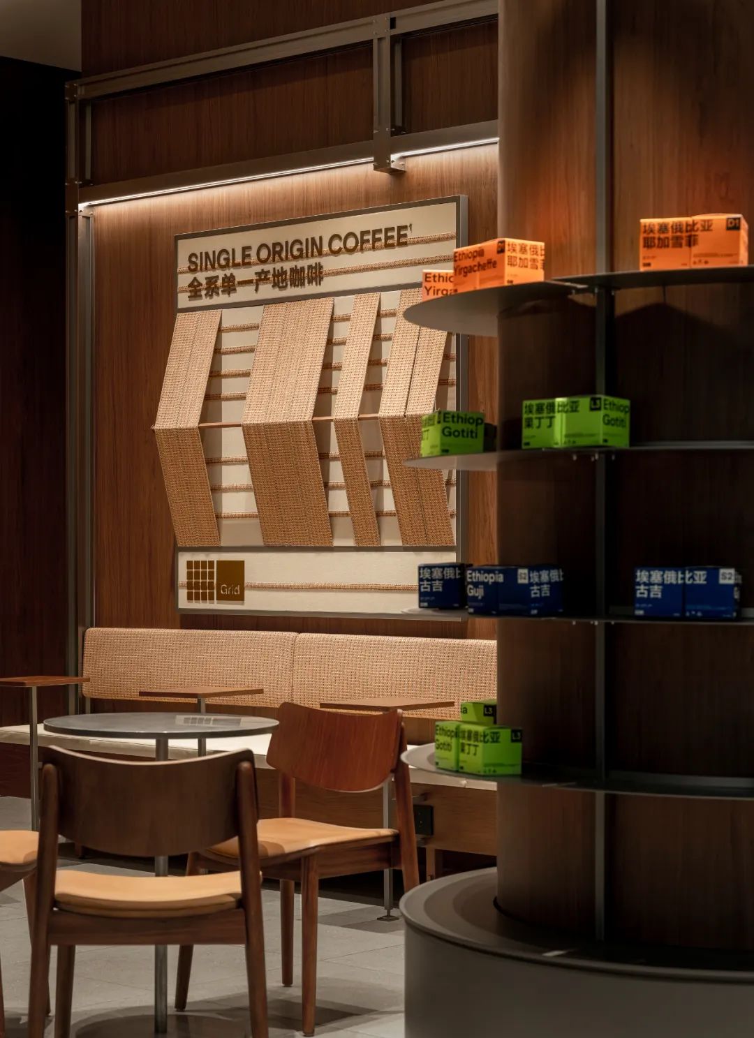
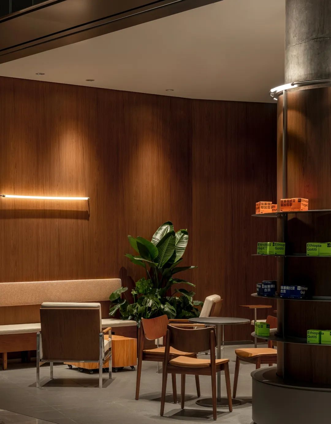
Grid Coffee 专注单一产地咖啡。
我们寻找全世界最优质的咖啡豆,通过专业规则之下的反复打磨,让它变得可靠,并且负担得起,让更多人能享受得到。
与此同时,我们也选择了高品质的牛奶与之搭配,并用最简单的方法冲煮咖啡,不再添加其他原料,尽可能保留咖啡的自然之美。
用好原料,关心基本款。
We search for the finest coffee beans worldwide, refining them through repeated processes under professional standards to make them reliable and affordable, so that more people can enjoy them.At the same time, we pair these beans with high-quality milk and brew the coffee using the simplest method, without adding any other ingredients, to preserve the natural beauty of the coffee as much as possible.We prioritize quality ingredients and focus on the basics.
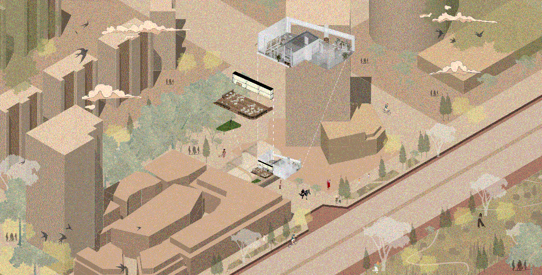
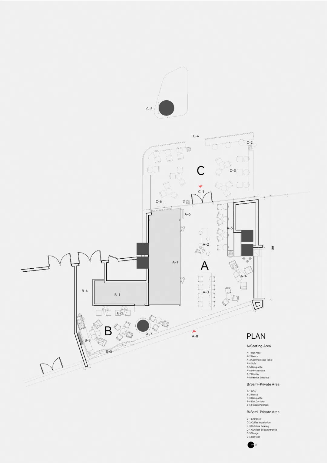
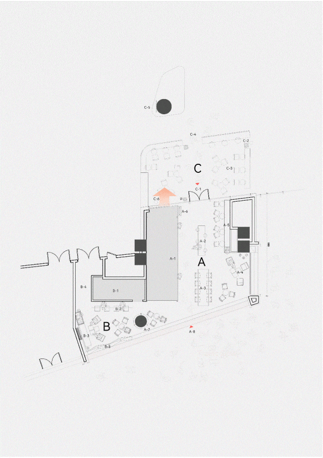
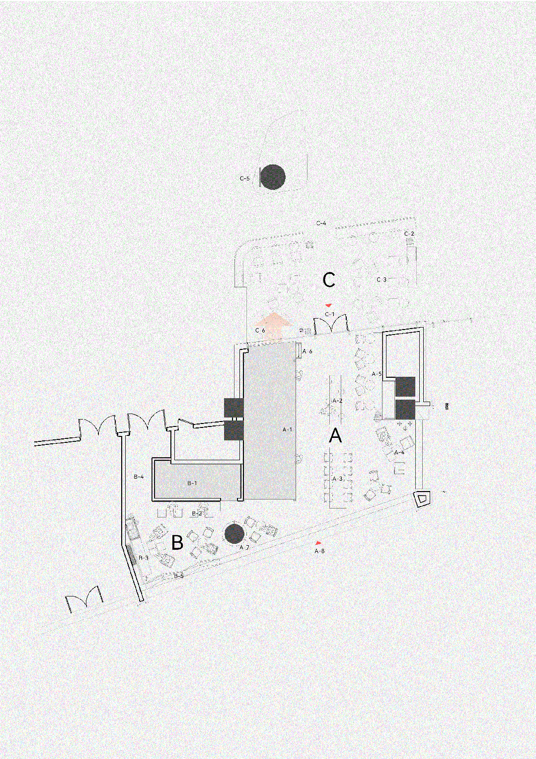
△Store Location
成都香港置地光环购物公园,该商业空间以公园式空间格局,打造了逛玩一体的顾客体验。人文,生态与商业相融合,是成都城市理想的栖息地。Grid Coffee门店位于两个商业体之间,在人流和景观的最佳位置。
Chengdu The Ring Shopping Mall by Hong Kong Land, designed with a park-like spatial layout, offers customers an integrated shopping and entertainment experience. Blending culture, ecology, and commerce, it serves as an ideal urban oasis in Chengdu. Grid Coffee's outlet is situated between two commercial buildings, occupying an optimal location with high foot traffic and picturesque views.
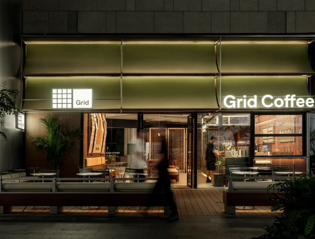
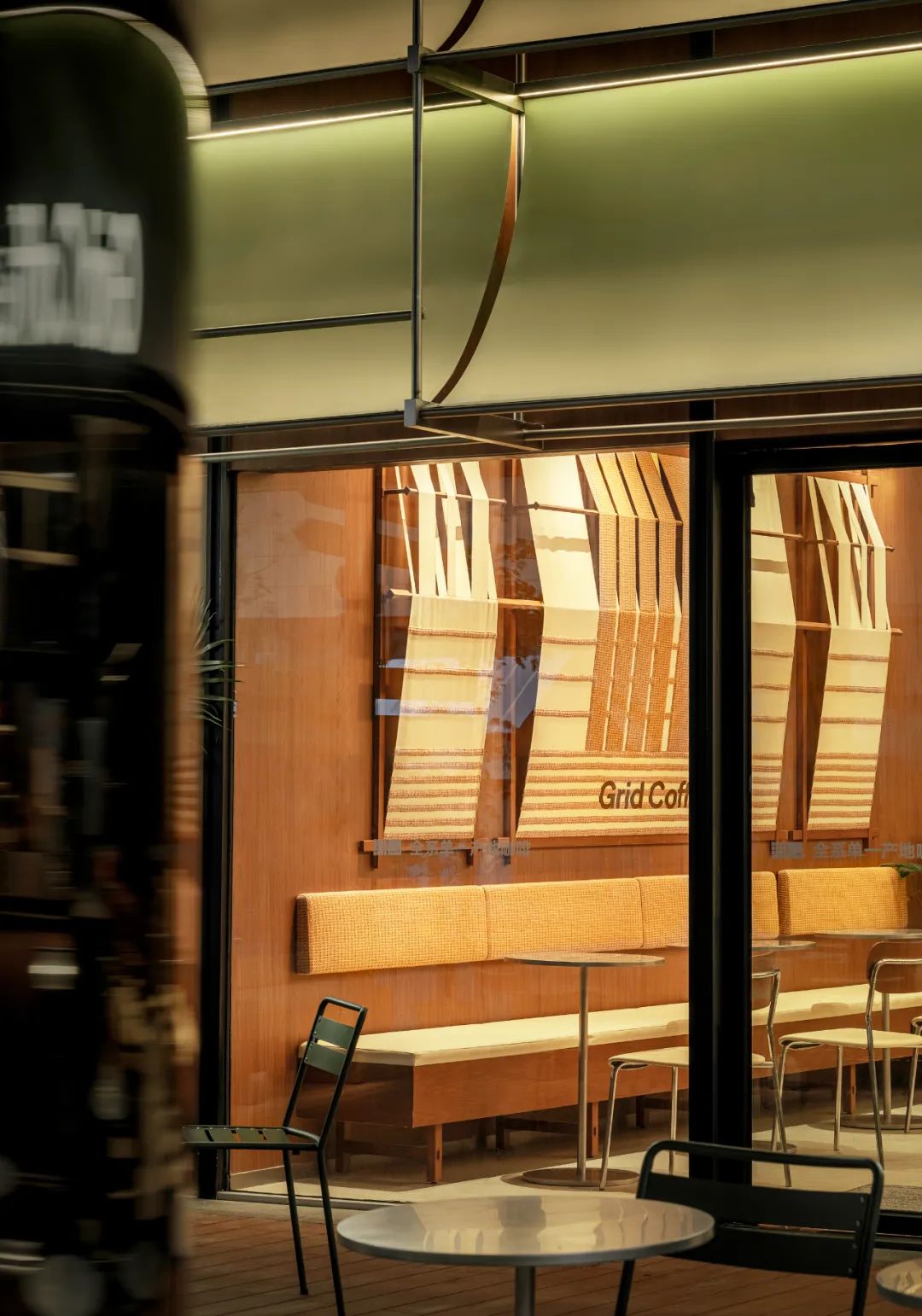
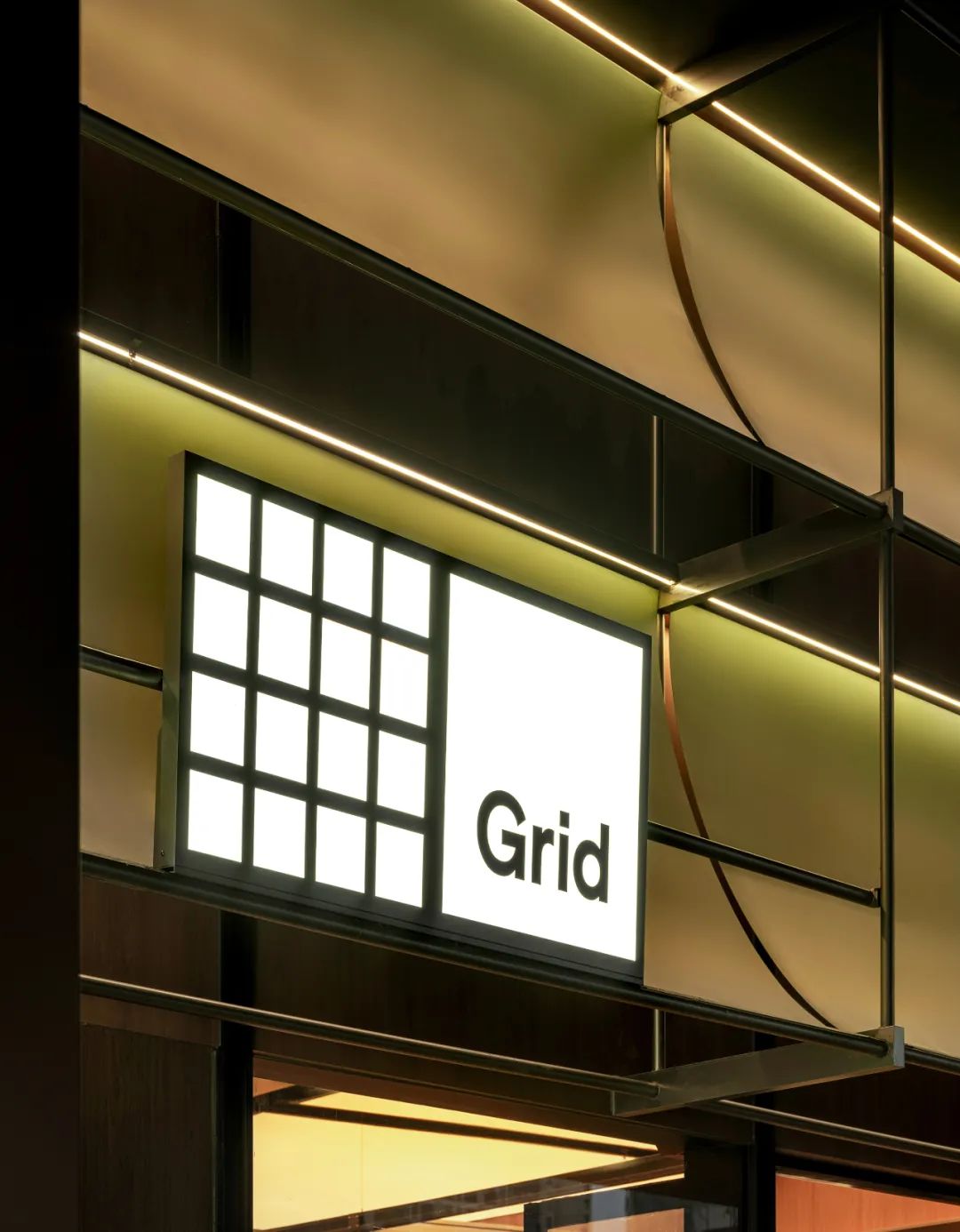
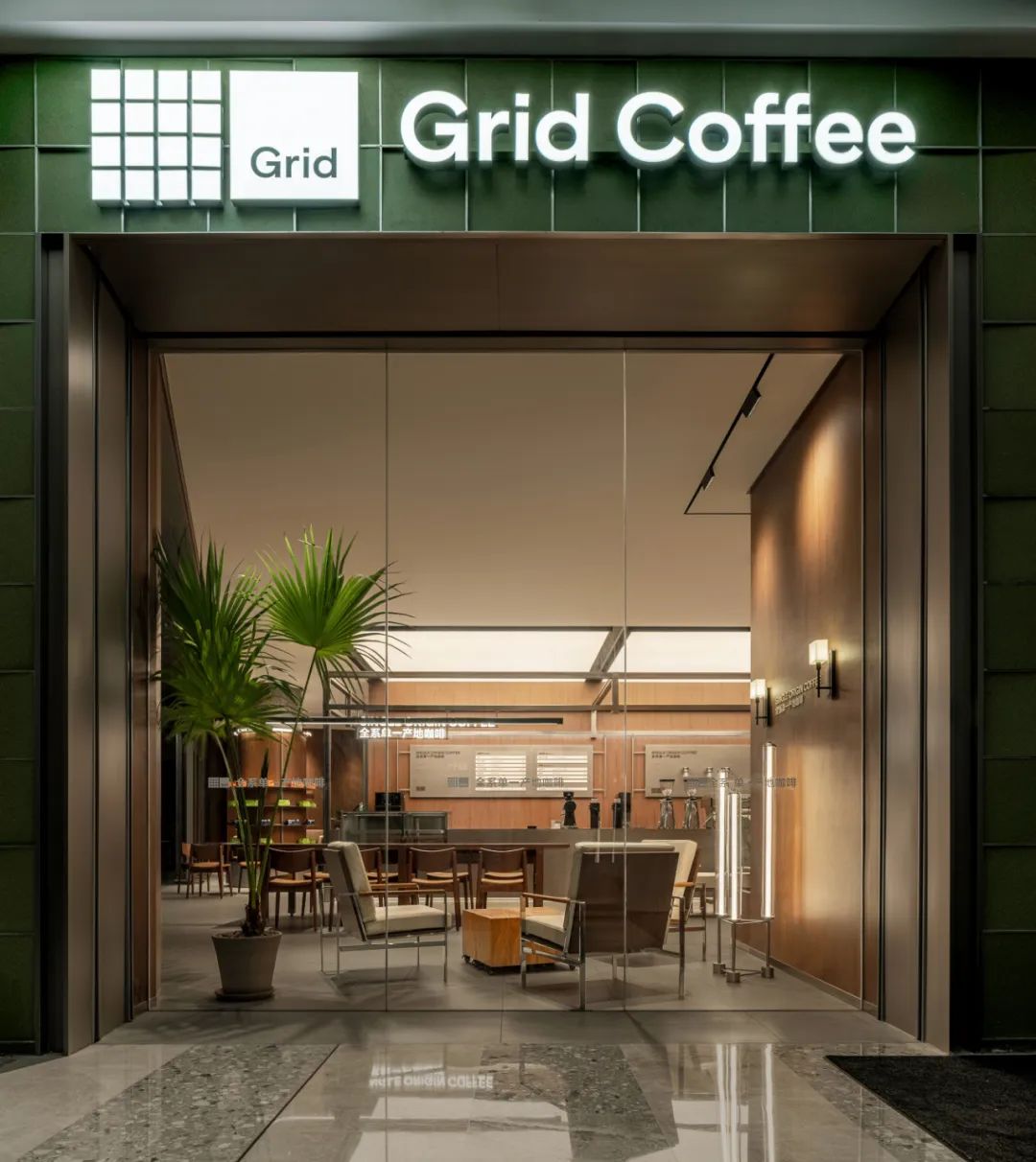
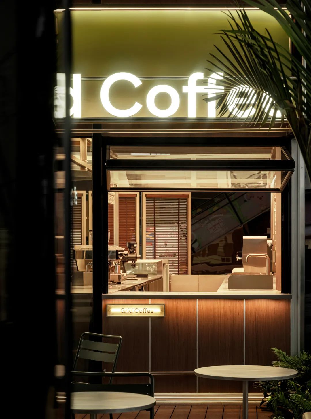
△Store Facade
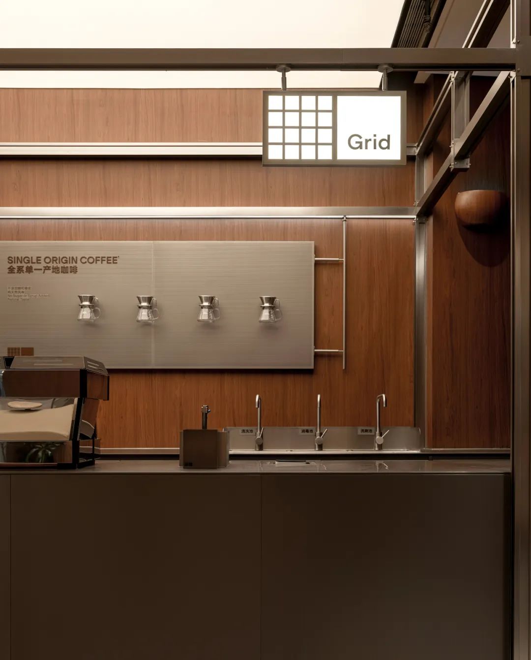
Grid Coffee的室外外立面采用了品牌标志性的绿色,这种色彩设计旨在增强品牌辨识度,让人一眼就能认出。外立面选用了超薄钢板材质,并巧妙地设计成弧形,其独特的质感仿佛让人置身于轻松的露营氛围中,营造出一种都市中的悠然自得感。
The exterior facade of Grid Coffee is adorned in the brand's signature green hue, a color design that intentionally enhances brand recognition, allowing people to instantly identify it. The facade is constructed from ultra-thin steel panels, artfully shaped into a curved form. Its unique texture evokes a sense of being immersed in a relaxed camping ambiance, fostering a serene and carefree feeling amidst the hustle and bustle of the city.
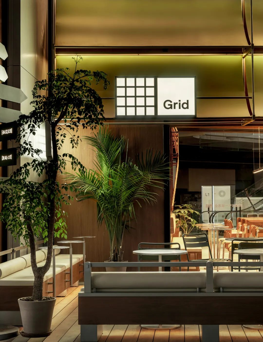
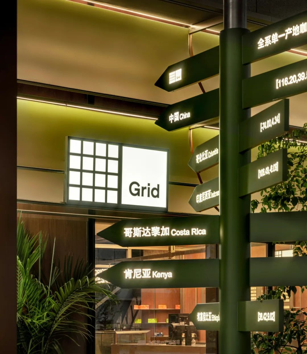
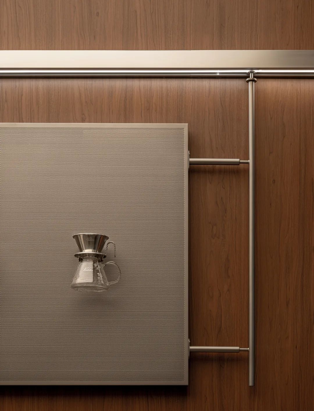
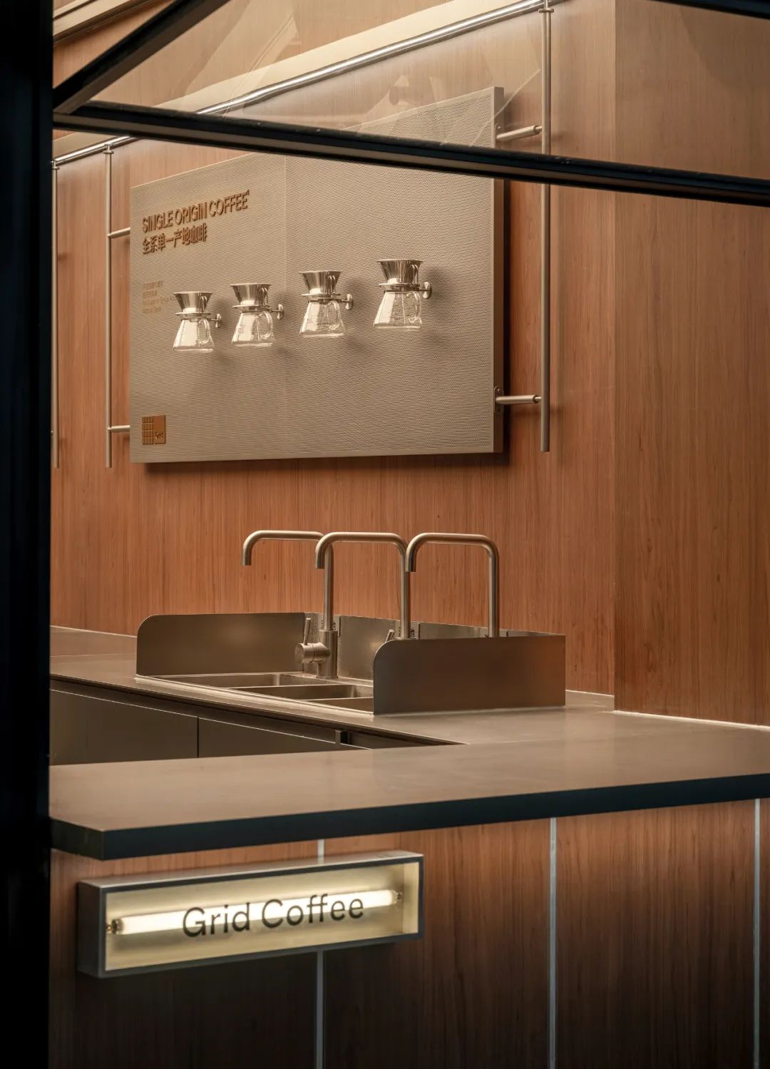
此外,外立面上还特别安装了单一产区咖啡豆指示装置,这一创意元素不仅增添了趣味性,更凸显了Grid Coffee对单一产区咖啡豆的专注与执着。这些指示装置如同小小的向导,引领着顾客深入探索每一款咖啡豆背后独特的风土故事,展现了品牌对咖啡品质的不懈追求和深厚底蕴。Furthermore, the installation of single-origin coffee bean indicators elevates the overall experience, imbuing the space with a playful touch while underscoring Grid Coffee's dedication to and expertise in the specialized field of sourcing beans from distinct regions. These indicators serve as a testament to the brand's commitment to quality and authenticity, inviting customers to explore the nuances of each origin's unique flavor profiles.Grid Coffee的室外外立面设计完美融合了品牌特色、自然元素与咖啡文化,打造了一个既现代又充满情调的咖啡空间,吸引着每一位咖啡爱好者的目光。
Furthermore, the installation of single-origin coffee bean indicators elevates the overallexperience, imbuing the space with a playful touch while underscoring Grid Coffee's dedication to and expertise in the specialized field of sourcing beans from distinct regions. These indicators serve as a testament to the brand's commitment to quality and authenticity, inviting customers to explore the nuances of each origin's unique flavor profiles.
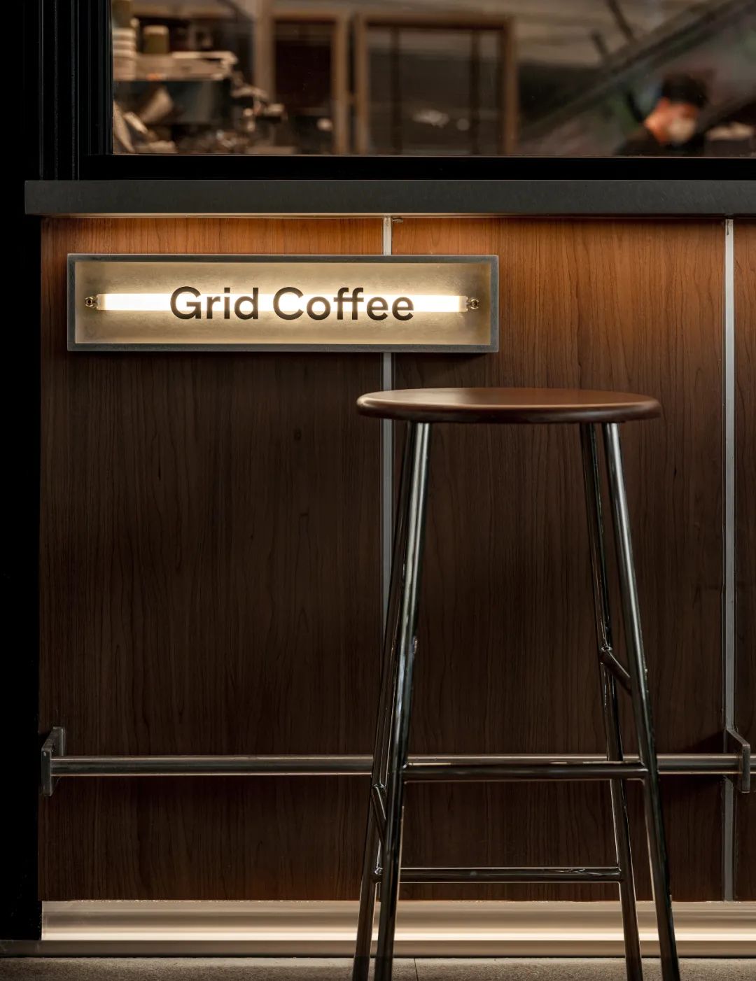
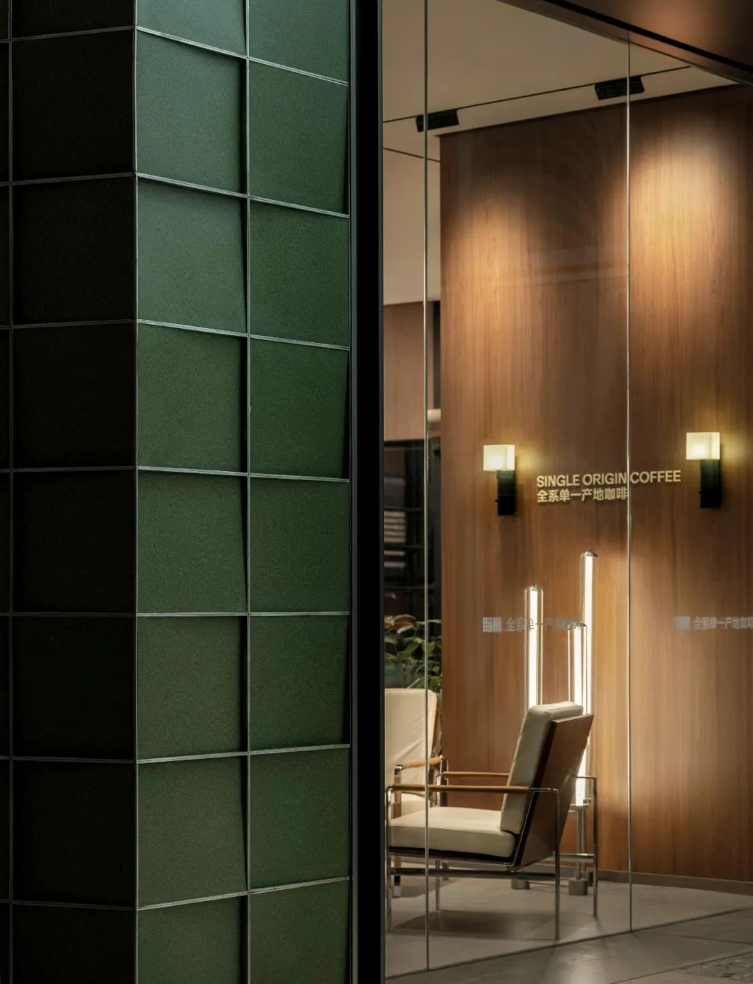
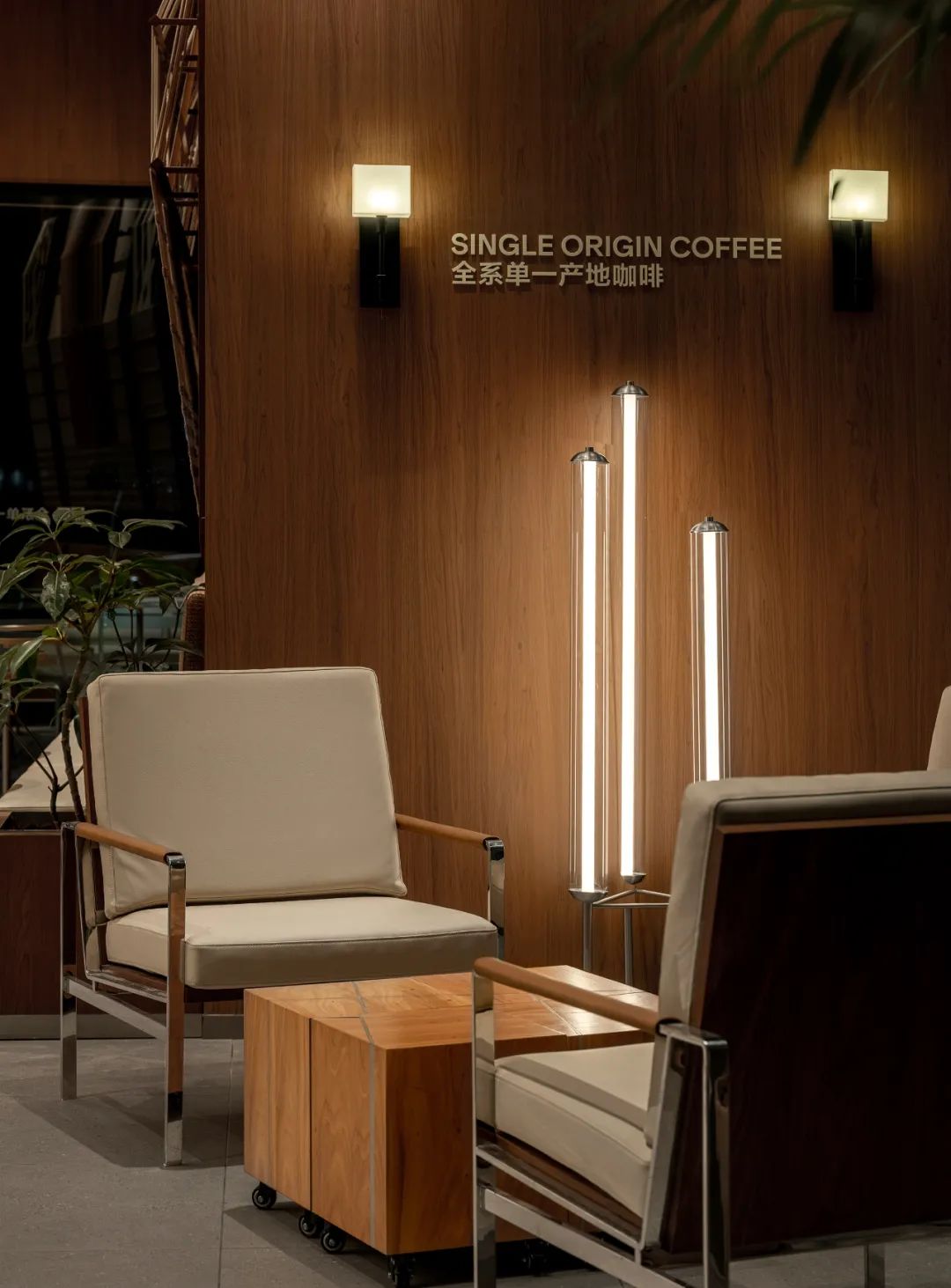
△Interior Facade
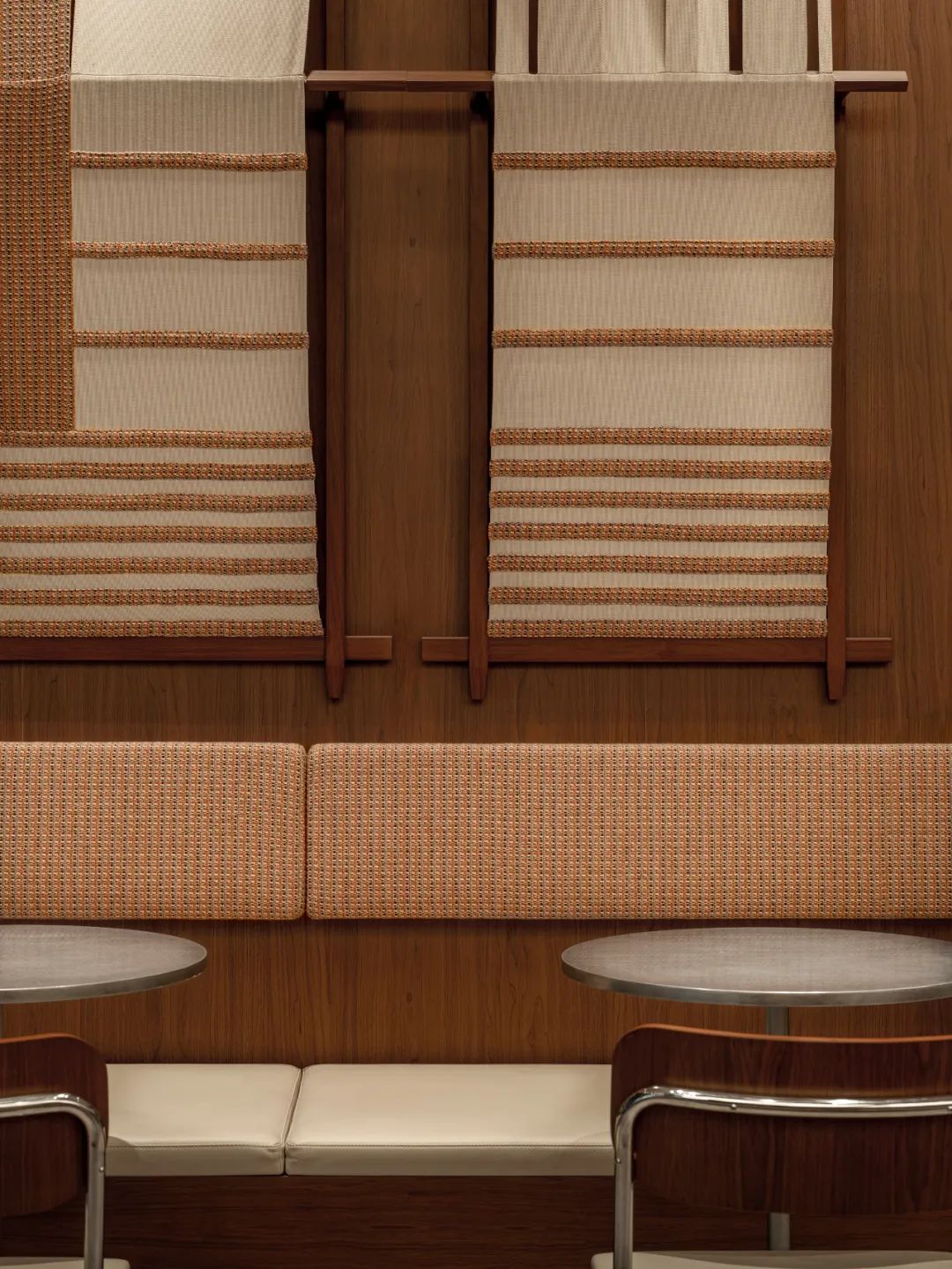
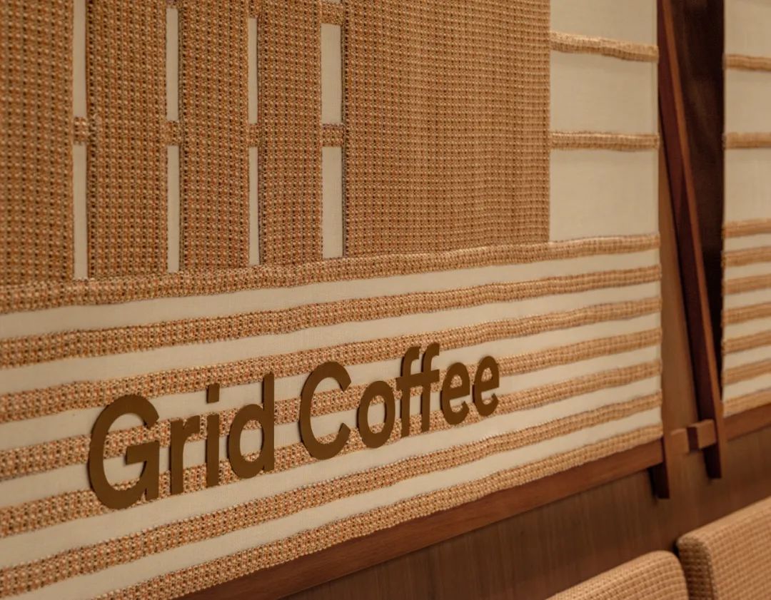
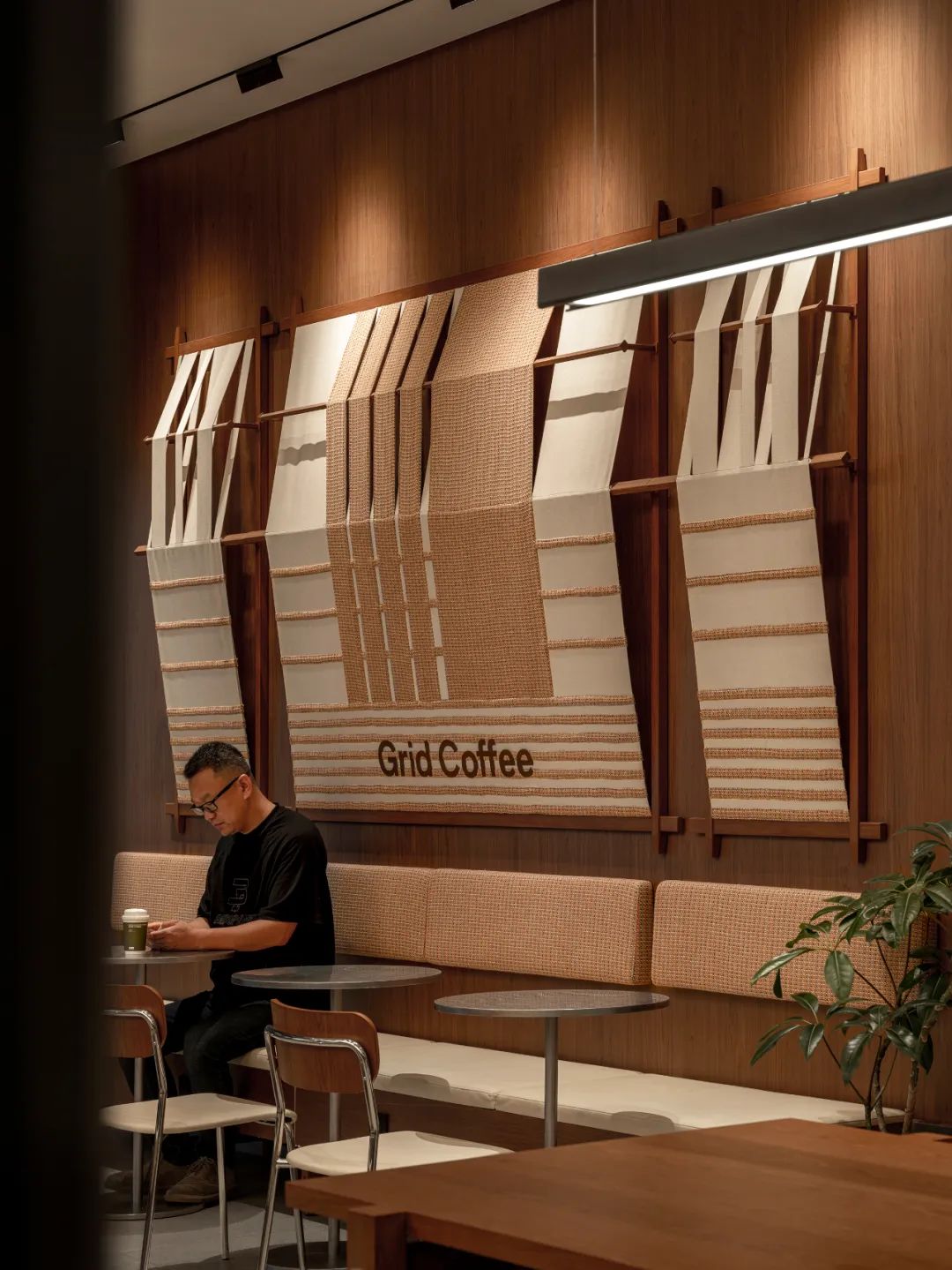
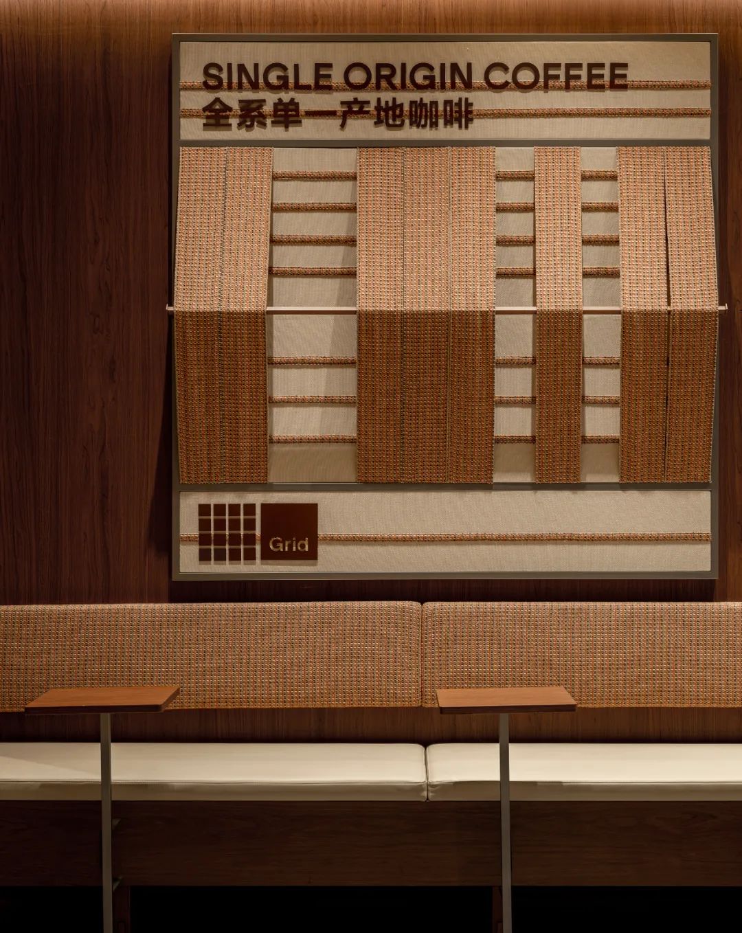
笑脸蜘蛛巧妙的将Grid网格概念融入室内外立面设计中,通过精心设计的、高低错落的网格图案,巧妙地再现了咖啡种植区那连绵起伏的山脉景象,同时赋予每个网格单元以独特的肌理,以网格绿为主色调,展现了设计的独特韵味。这一设计不仅强化了品牌的绿色标识,更仿佛将大自然的鬼斧神工引入都市空间,让人们在繁忙的都市生活中也能感受到一丝来自远方的宁静与自然之美。网格的高低起伏如同大地的呼吸,而不同的肌理则像是诉说着每一颗咖啡豆背后的故事,让人在欣赏设计之美的同时,也能深刻体会到Grid Coffee对咖啡品质的极致追求和对自然之美的无限向往。Spider Creative ingeniously incorporates the Grid concept into Grid Coffee's indoor and outdoor facades, recreating the rolling hills of coffee plantations through meticulously designed, staggered grid patterns. Each grid cell boasts a unique texture, and the dominant grid green hue showcases the design's distinctive charm.This design not only reinforces the brand's green identity but also brings the wonders of nature into urban spaces, offering a glimpse of tranquility and natural beauty amidst the bustle. The undulating grids mimic the earth's breath, while the textures narrate the stories behind each coffee bean, allowing patrons to appreciate the design's beauty while deeply understanding Grid Coffee's unwavering commitment to coffee quality and its boundless admiration for nature's beauty.
这一设计不仅是一次视觉上的盛宴,更是一次心灵的洗礼,它让Grid Coffee的室内外空间成为了一个连接自然、品牌与消费者的独特桥梁。
In summary, this design is not just a visual extravaganza; it's also a purifying experience for the soul. It transforms Grid Coffee's indoor and outdoor spaces into a distinctive bridge, connecting nature, the brand, and its consumers.
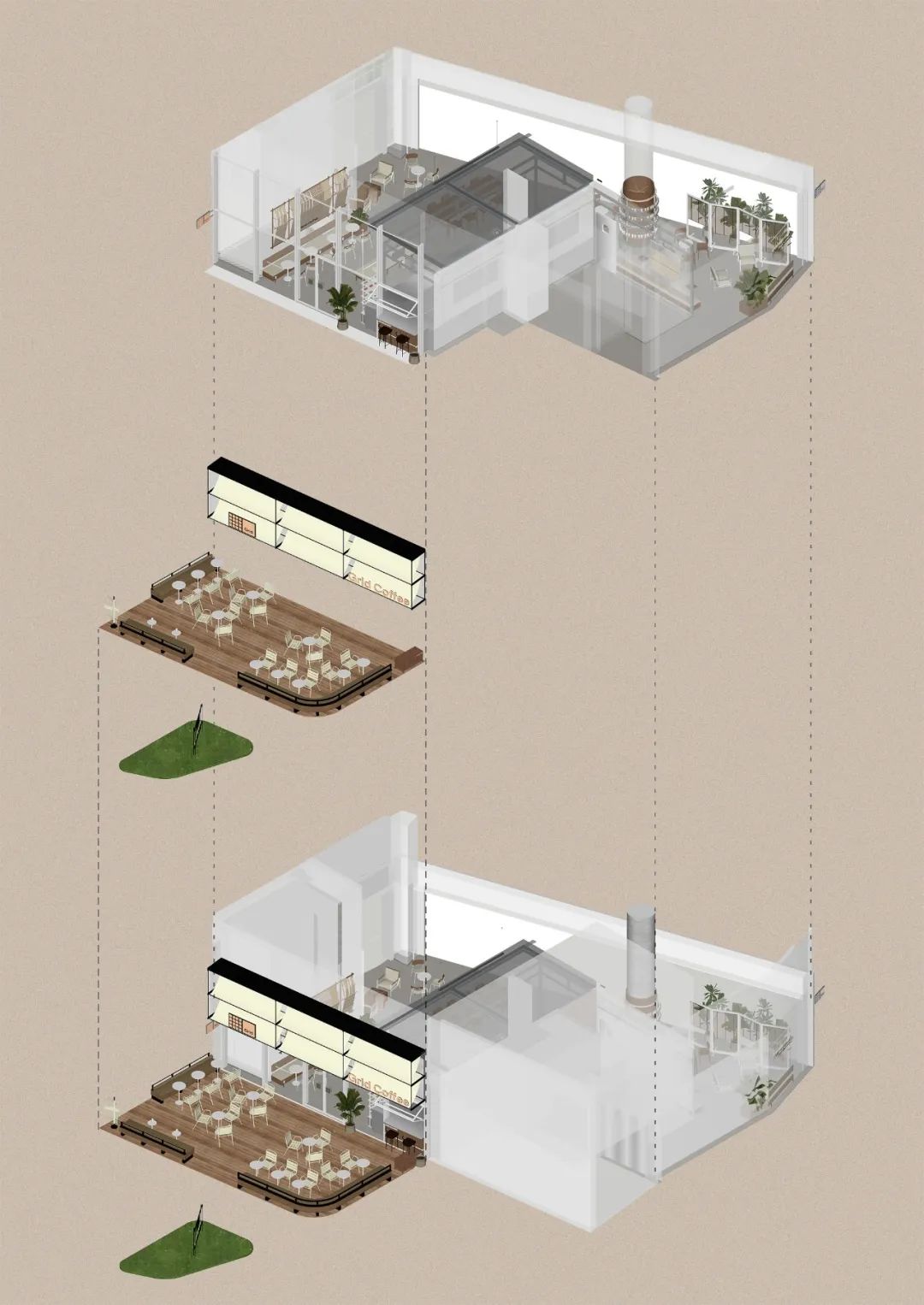
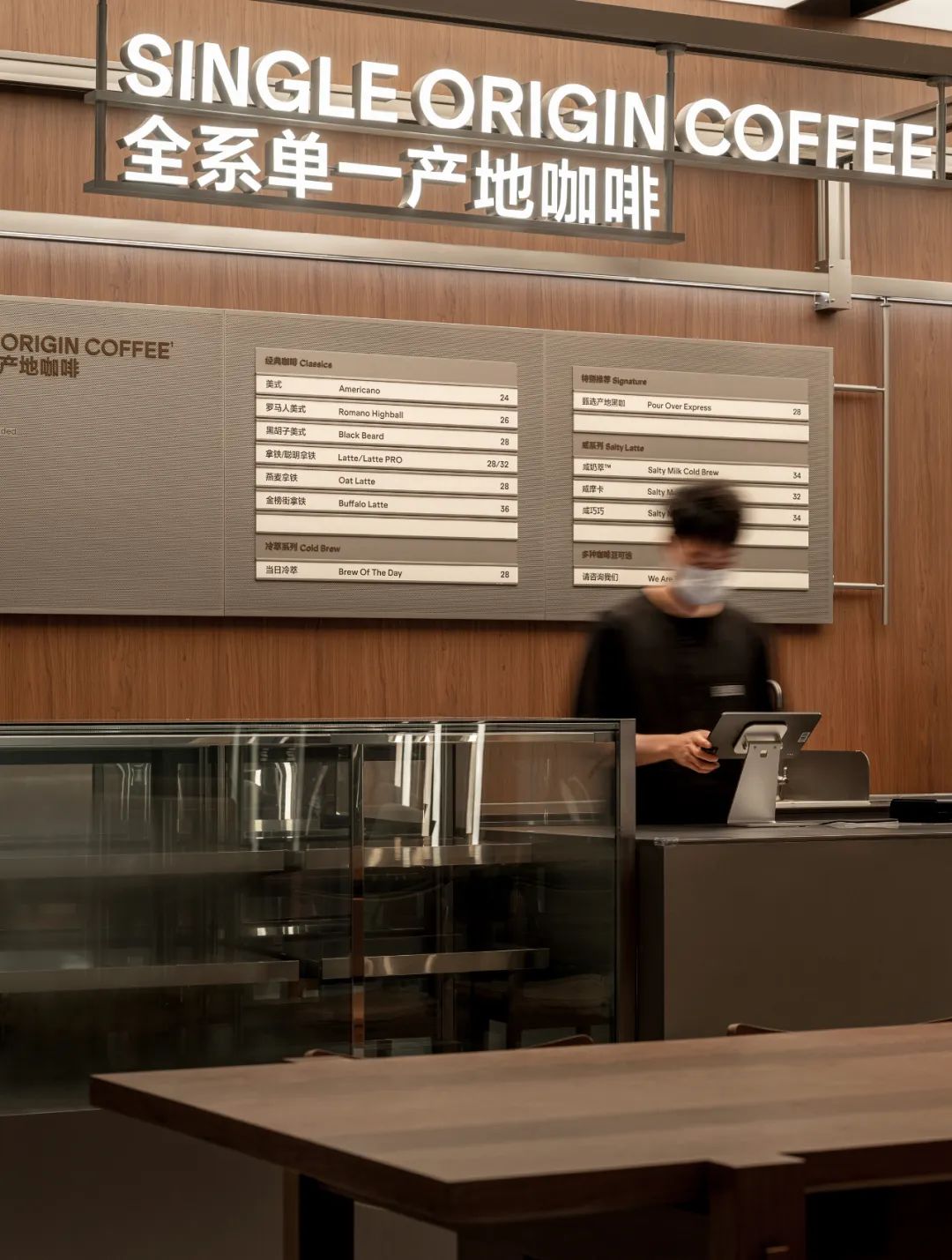
△Store Analysis
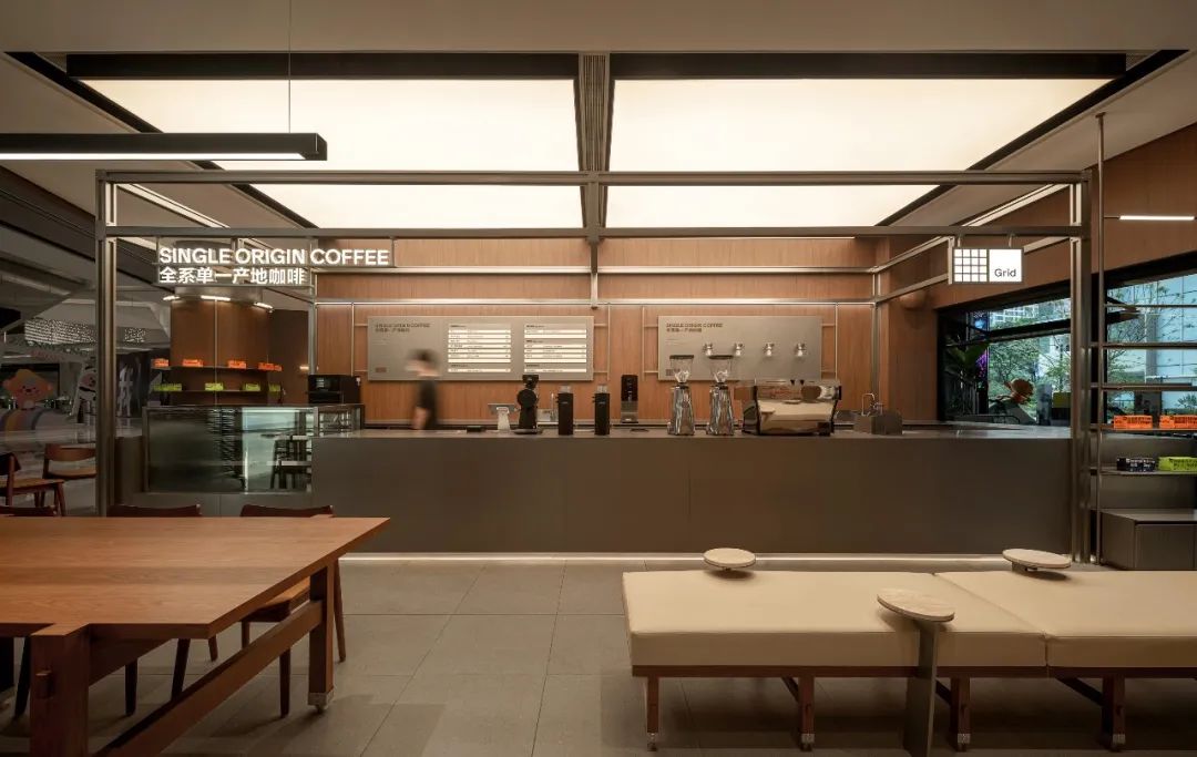
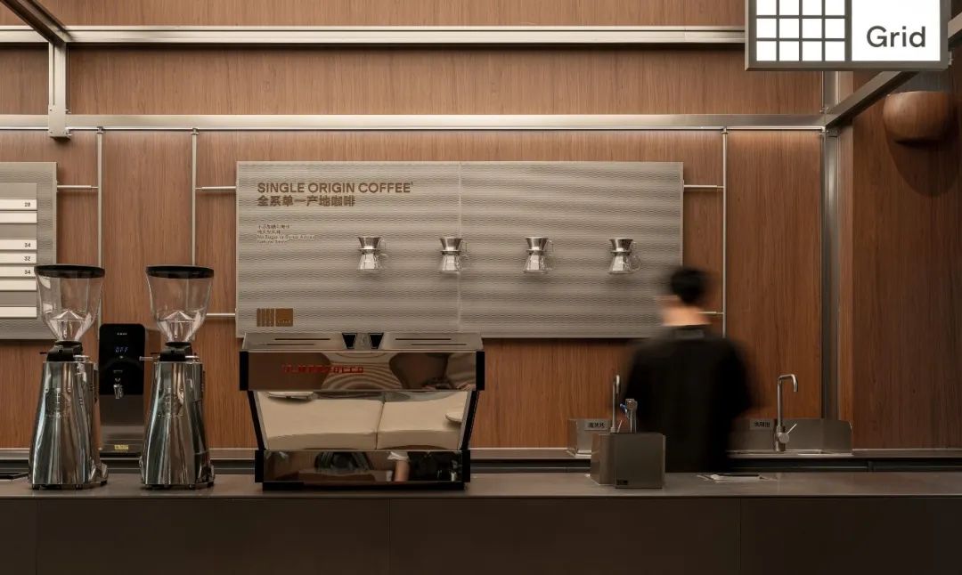
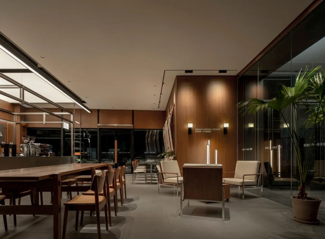
在咖啡空间里,吧台不仅是咖啡制作的中心,更是艺术与功能完美融合的舞台。我们通过其独特的设计理念,巧妙地将吧台区域打造成了一个既专业又充满灵感的场所,让每一位踏入这里的咖啡爱好者都能感受到不同寻常的氛围。
In the coffee space, the bar counter is not only the heart of coffee making, but also a stage where art and function seamlessly intertwine. Through our unique design concept, we have skillfully transformed the bar area into a professional yet inspiring venue, where every coffee enthusiast who steps in can sense an extraordinary atmosphere.
灯光设计的巧思:可调节灯光的运用,是这一设计的一大亮点。它不仅仅是为了照明,更是为了营造氛围,讲述故事。根据不同的时间段、节日或活动主题,灯光可以柔和地变换色彩与亮度,为每一杯咖啡的诞生过程增添一抹神秘或温馨的色彩。这样的设计,既提升了顾客的体验感,也使得吧台区域成为了一个多功能的社交与活动空间。The ingenious lighting design, featuring adjustable illumination, stands out as a major highlight of this concept. It serves not merely for illumination, but also to create ambiance and narrate stories. Depending on different time periods, festivals, or event themes, the lighting can gently shift in color and brightness, adding a touch of mystery or warmth to the process of crafting each cup of coffee. This design not only enhances the customers' experience but also transforms the bar area into a versatile space for socializing and events.
核心空间DNA的传承:Grid Coffee在吧台设计中延续了其品牌的核心空间DNA元素,这种连贯性和一致性让顾客在享受咖啡的同时,也能深刻感受到品牌的独特魅力和文化底蕴。无论是材质的选择、色彩的搭配,还是整体布局的考量,都透露出品牌对于细节的精雕细琢和对品质的不懈追求。
Inheritance of Core Spatial DNA: Grid Coffee has seamlessly incorporated its brand's core spatial DNA elements into the bar counter design. This continuity and consistency allow customers to deeply appreciate the brand's unique charm and cultural depth while enjoying their coffee. From material selection, color schemes, to overall layout considerations, every detail showcases the brand's meticulous attention to detail and relentless pursuit of quality.
可拓展性的考量:在设计之初,Grid Coffee就充分考虑到了吧台区域在未来可能承担的多重角色。可调节灯光、灵活的布局设计以及预留的接口和空间,都为后期的活动拓展提供了极大的便利。无论是举办小型音乐会、艺术展览,还是咖啡品鉴会,吧台区域都能迅速转换角色,满足多样化的需求。Scalability Considerations: From the very onset of the design process, Grid Coffee took into account the potential multiple roles that the bar area might assume in the future. The use of adjustable lighting, flexible layout design, and pre-allocated interfaces and spaces provide significant convenience for future event expansion. Whether it's hosting small concerts, art exhibitions, or coffee tastings, the bar area can swiftly transform to cater to diverse needs.Grid Coffee的吧台设计是一次成功的尝试,它不仅仅是一个咖啡制作的空间,更是一个集艺术、功能与社交于一体的多功能舞台。在这里,每一杯咖啡都承载着咖啡师的热情与匠心,另外我们通过平面将室外和室内空间上做了联通,更增强了室外的咖啡氛围感受,同时后期可以将功能区做拓展,而吧台的设计则让这份热情得以更好地传递和展现。
The bar counter design of Grid Coffee represents a successful endeavor, as it transcends being merely a space for coffee making into a versatile stage that integrates art, function, and socializing. Here, every cup of coffee embodies the passion and craftsmanship of the baristas. Additionally, we've created a seamless connection between the indoor and outdoor spaces through our layout design, further enhancing the coffee ambiance outdoors. This also allows for future expansion of functional areas, while the design of the bar counter ensures that this enthusiasm is conveyed and showcased even more effectively.
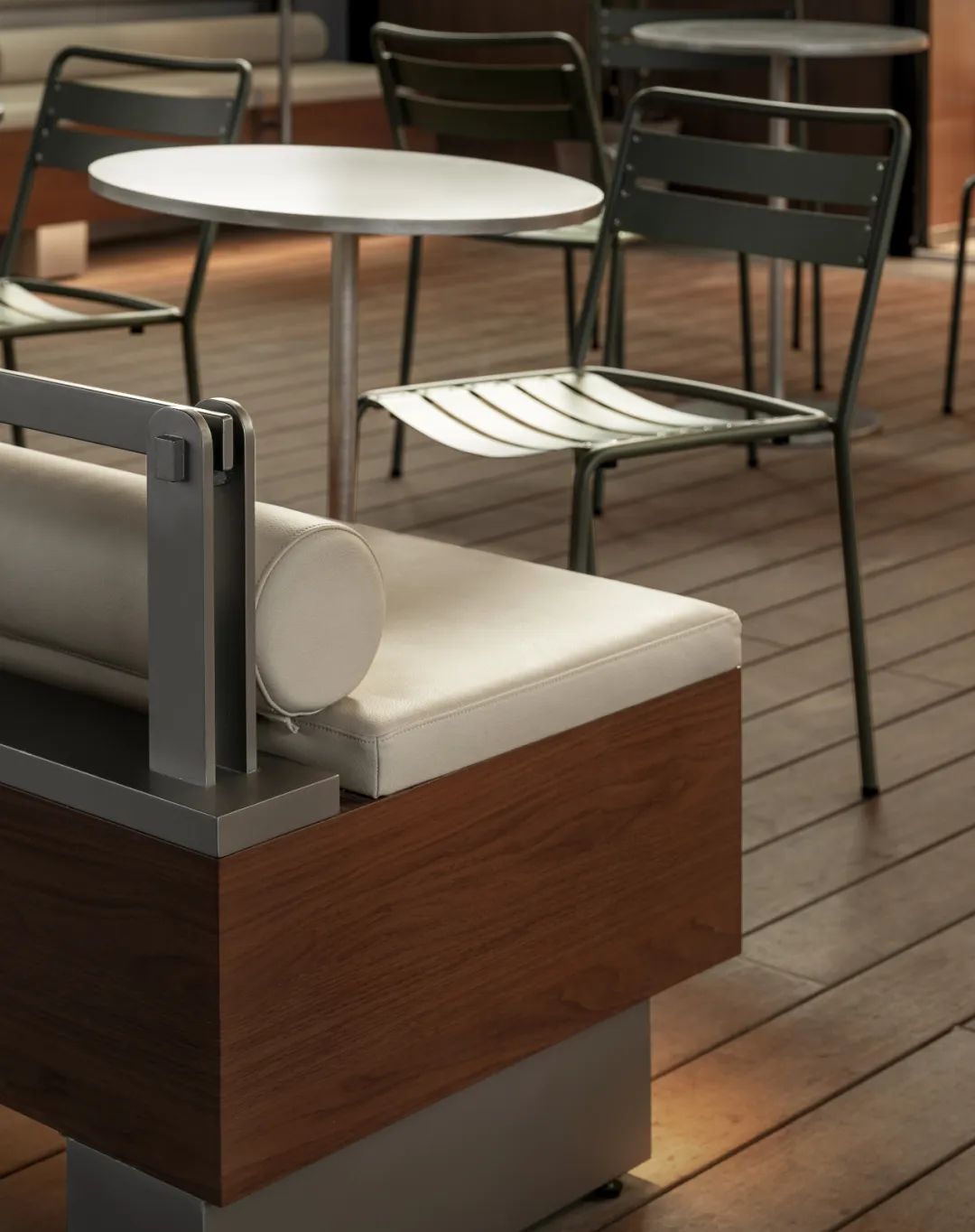
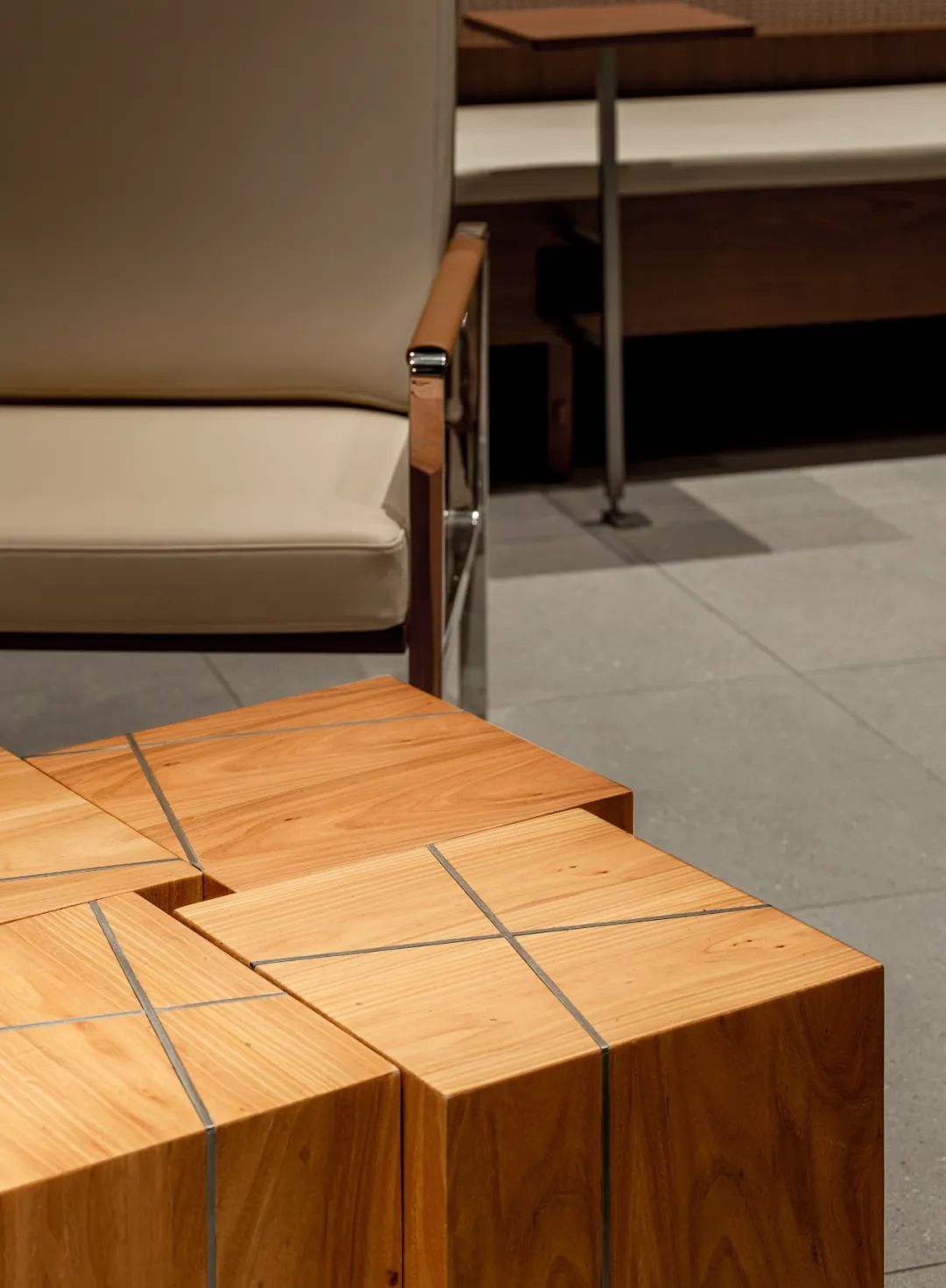
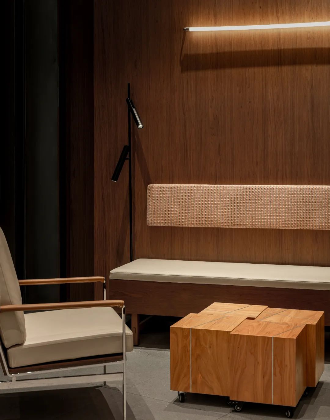
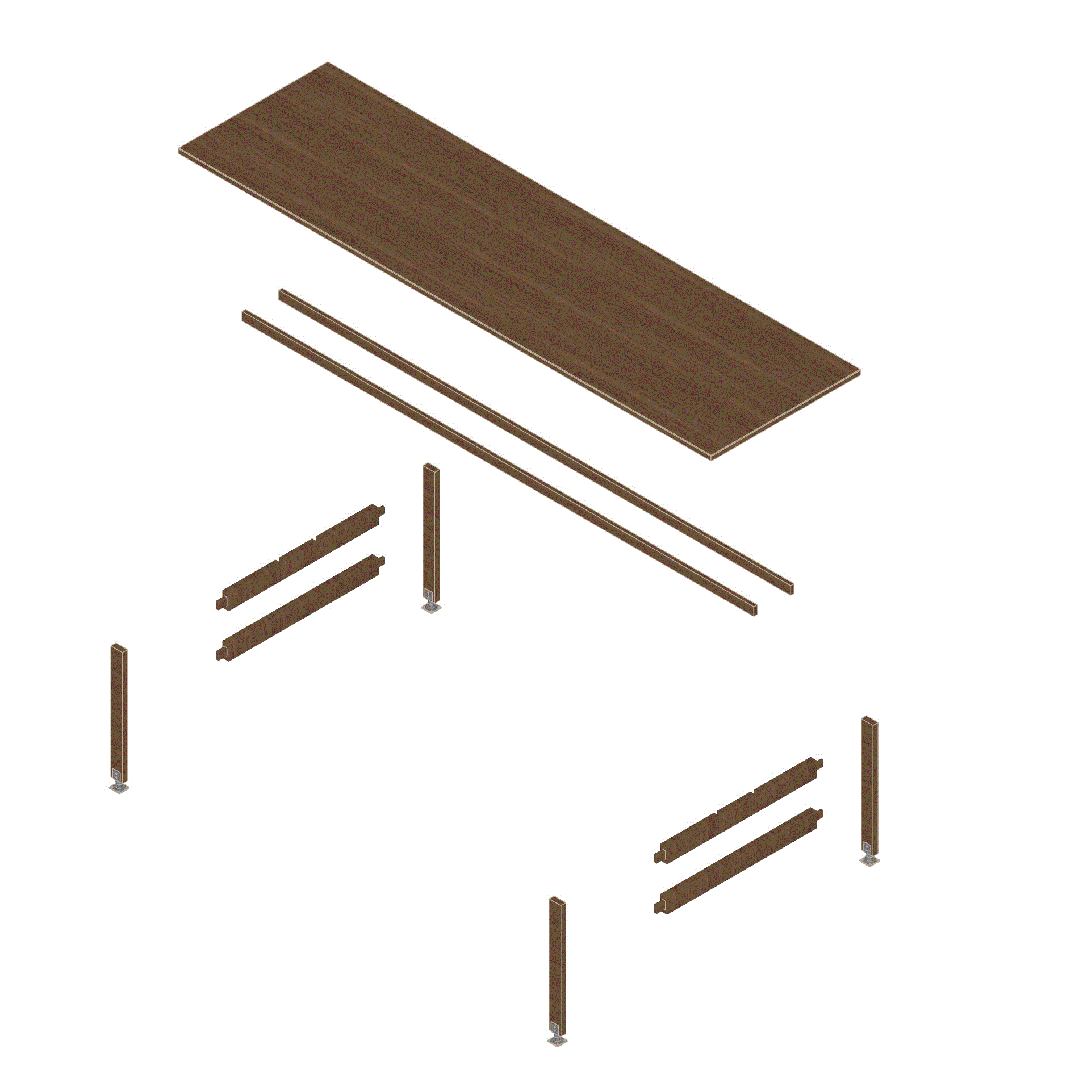
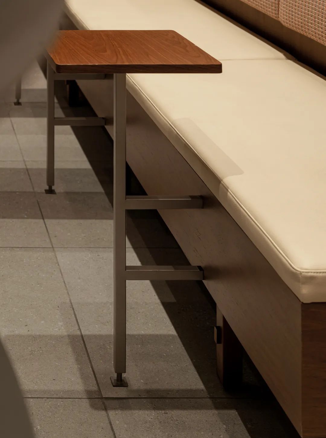
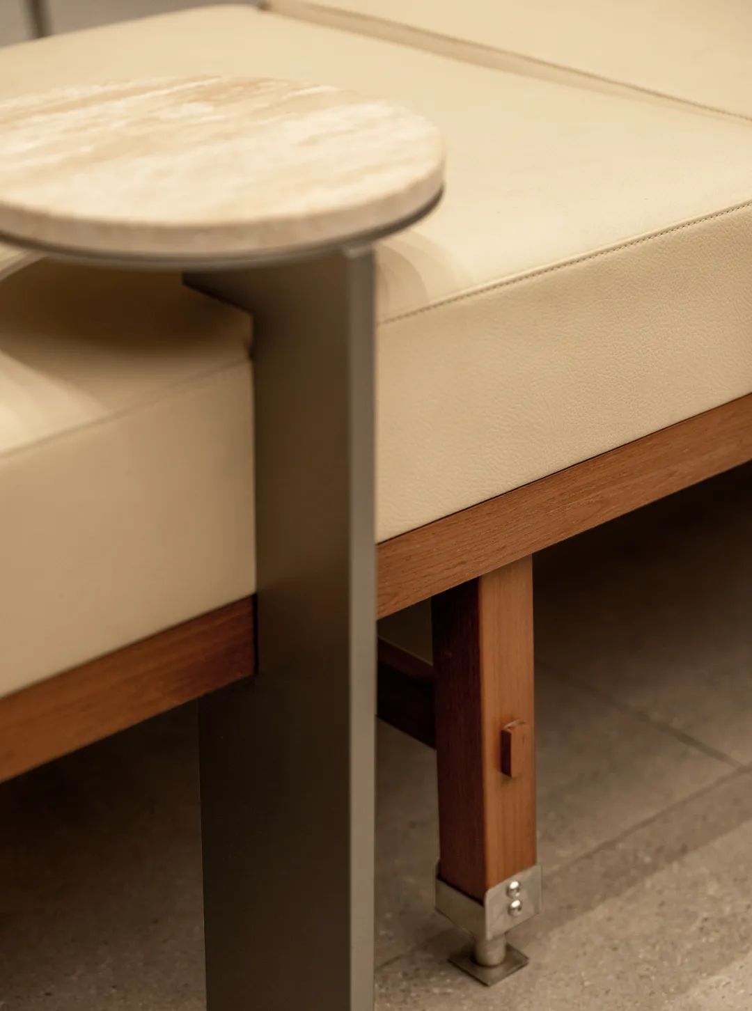
△Coffee Block Table
Table Block,我们尝试用格子的表达方式,设计可以灵活应变的coffee table,适应不同的顾客人群。
Table Block, We are trying a coffee table that can adapt flexibly to different customer groups.
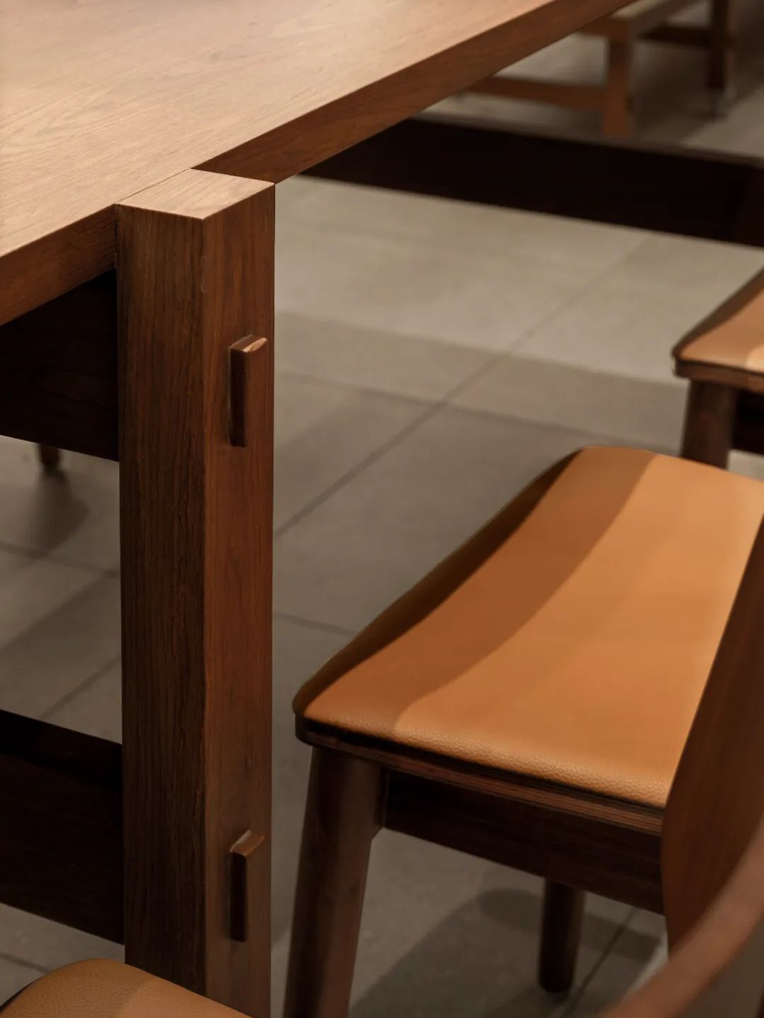
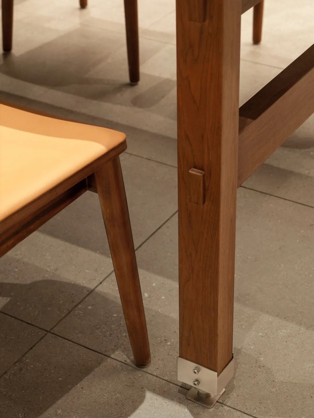
家具设计上的细节:充分与本地文化结合,将蜀锦织布机的元素应用到空间中,在卡座的单桌腿部,和交流桌的整体设计上进行应用和贯穿,既体现了蜀锦织布机的元素特征,也与中国传统的榫卯结构相联系。
Details in furniture design: To fully integrate with local culture, elements of Shu Brocade looms are incorporated into the space. These elements are applied and carried through in the design of the single table legs of the booth seating and the overall design of the communal tables, not only embodying the characteristic elements of Shu Brocade looms but also connecting with traditional Chinese mortise and tenon joints.
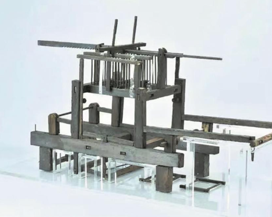
△蜀锦织布机原型
△Table Design Process

Local Elements Art Installation

△蜀锦&Grid Coffee

△蜀锦装置设计过程

与当地文化结合,以成都蜀锦为灵感源泉,旨在通过现代设计手法,将这一传统工艺的美学精髓融入当代空间之中,创造出一个既富有历史文化底蕴又不失现代感的艺术环境。
This spatial art project draws inspiration from Chengdu's Shu Brocade, aiming to integrate the aesthetic essence of this traditional craft into contemporary spaces through modern design techniques, thereby creating an artistic environment that is imbued with rich historical and cultural heritage while remaining modern and up-to-date.
设计核心在于“传承与创新”。首先,我们从蜀锦的丰富图案与色彩中提炼元素,如祥云、瑞兽、花卉等传统纹样,以及鲜艳而和谐的色彩搭配,这些都是蜀锦文化的独特标识。这些元素将被巧妙地解构与重组,以抽象或具象的形式呈现在空间的不同界面上,如墙面、地面、天花板以及家具陈设之中,形成视觉上的连贯与惊喜。
The core of the design revolves around "Inheritance and Innovation." Firstly, we extract elements from Shu Brocade's diverse patterns and vibrant colors, such as traditional motifs like auspicious clouds, mythical creatures, and flowers, as well as its harmonious and striking color schemes, all of which are unique identifiers of Shu Brocade culture. These elements will be skillfully deconstructed and recombined, appearing in abstract or figurative forms across various interfaces within the space, including walls, floors, ceilings, and furniture arrangements, fostering a visually coherent and delightful experience.
Design Thinking of Business

取舍之间
如上图红色区域所示,室内入口门面跨度接近16米长,上有双道消防卷帘,同时直接面对商场人流量最大的扶梯位置,在如此长的外立面中,一般情况下会采用封闭的方式。能够使得室内相对舒适,设计上面也会相对较容易处理。但我们在分析了整体环境、人流后判断此处需要进行开放式的设计,这样会带来几个好处;1-空间灵活可变,为门店后期的空间活动,人流通道控制也好留出了空间。2-由于开敞式的设计,主动将人流吸引到门店内部,实际促成门店更多销售转化。这对于做生意本身是关键的核心设计体现。

氛围营造
我们平面布置将吧台与外立面窗口衔接,既能使得这里成为顾客打卡的内容,同时也将内部制作咖啡的氛围传递给外部经过的人们,转化既是如此微妙的产生,每每经过门店都会将这种美好带走。
项目信息
品牌:Grid Coffee
门店:成都光环购物中心
设计: 笑脸蜘蛛|Spider Creative
摄影: 图派视觉
网站:www.spidercreative.cn
鸣谢:Grid Coffee设计团队
Brand: Grid Coffee
Store:Chengdu The Ring
Design: Spider Creative
Photography: TOPIA
Website: www.spidercreative.cn
笑脸蜘蛛是一家服务于全球品牌空间创新体验的设计公司。业务涵盖新消费空间和文化创意空间两大板块,涉及建筑及室内设计。我们更注重艺术与商业在空间中的创新结合,以前瞻性的创新设计与品牌体验,为全球品牌方提供最有价值的空间创新体验设计与咨询服务。我们的愿景是基于中国,成为世界具有影响力的品牌空间体验设计公司。Spider Creative, is a design and consultancy company based in Shanghai,working internationally focus on experience & innovation design.Smiley Spider(Spider Creative) is a rare species. It has incomparable super ability, superhuman endurance, reaction, agility, speed and creativity. Smiley face represents positive energy, which also means that our design is unique. Our team comes from different backgrounds and different majors, has an international vision, strong creativity and happy mind, and constantly explores and tries to break through limitations, Provide the brand with the most valuable space innovation experience design and consulting services.
Our vision
Spider Creative,based China, leading experience &innovation design around the world.
笑脸蜘蛛创始人先后分别在世界咖啡领导品牌星巴克及新茶饮头部品牌喜茶担任最高设计领导职位, 创建和带领内部(In-house)设计团队,负责全球门店创新体验设计工作,完成了诸多有影响力的创新空间体验项目,其中包含了各类创新概念的探索和品牌旗舰势能门店,在整个创作过程中不断突破设计边界,探索更多可能性。另外创始人不仅仅在空间和体验上追求卓越的设计,我们是新零售行业头部品牌的亲历者,对设计如何提升品牌形象和促进品牌的发展有着深刻的认识,同时游走于甲乙方带来不局限于一环的通透视角。设计对一个企业具有生死攸关的作用,笑脸蜘蛛的创立,是通过设计为全球品牌创造长期商业价值。
The founder of Spider Creative has successively held the top design leadership positions in Starbucks, the leading coffee brand, and Heytea, the leading brand of New Tea Drink. He has created and led the internal (in-house) design team, which is responsible for the innovative design of global stores, completed many influential innovative space experience projects, including the exploration of various innovative concepts and the brand flagship potential stores. In the process, he has constantly broken through the design boundary, Not only pursuing excellent design in terms of space and experience, but also being a first-hand experience of the head brand in the new retail industry, he has deeply know that design plays a vital role in an enterprise. Spider Creative,founded in China, leading experience &innovation design around the world and through design to create value for gloabl brands.